In our recent photoshoot for the BCGBrightHouse 2024 swag collection, we explored form, function, and the absurd. This project wasn’t just about showcasing our new swag—it was about challenging how we interact with everyday objects, much like how creatives like Maurizio Cattelan push boundaries with absurdist humor. By removing these objects’ typical roles, we sought new possibilities within familiar constraints.
One of the great inspirations behind this approach is Donald Norman’s seminal work, The Design of Everyday Things. Norman emphasizes that the success of a design lies in its balance of simplicity and usability, but he also challenges creatives to create absurd or illogical uses to better understand why function matters. His approach is about what works and learning from what doesn’t, a concept that guided our exploration in this photoshoot. You can explore Norman’s work here.
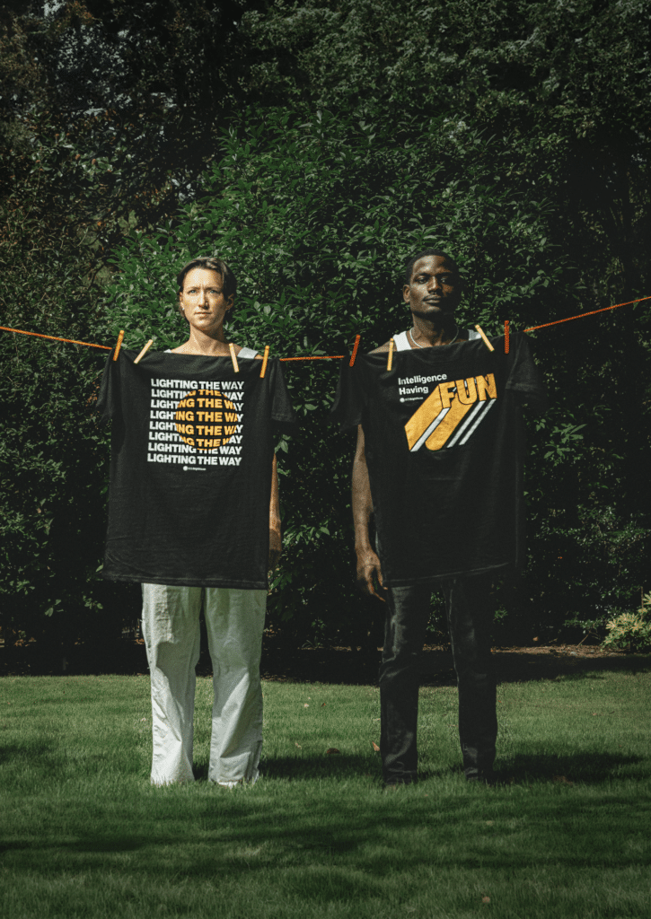
The Visual Language
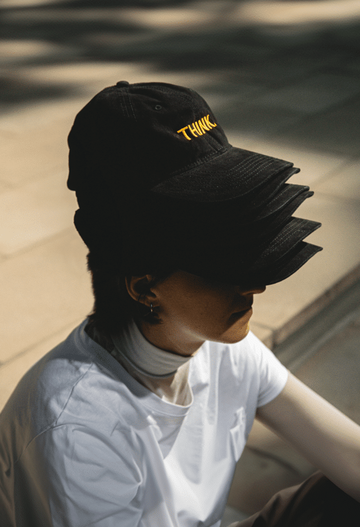
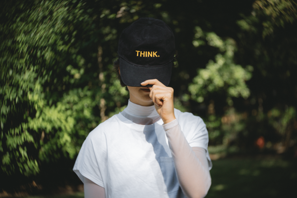
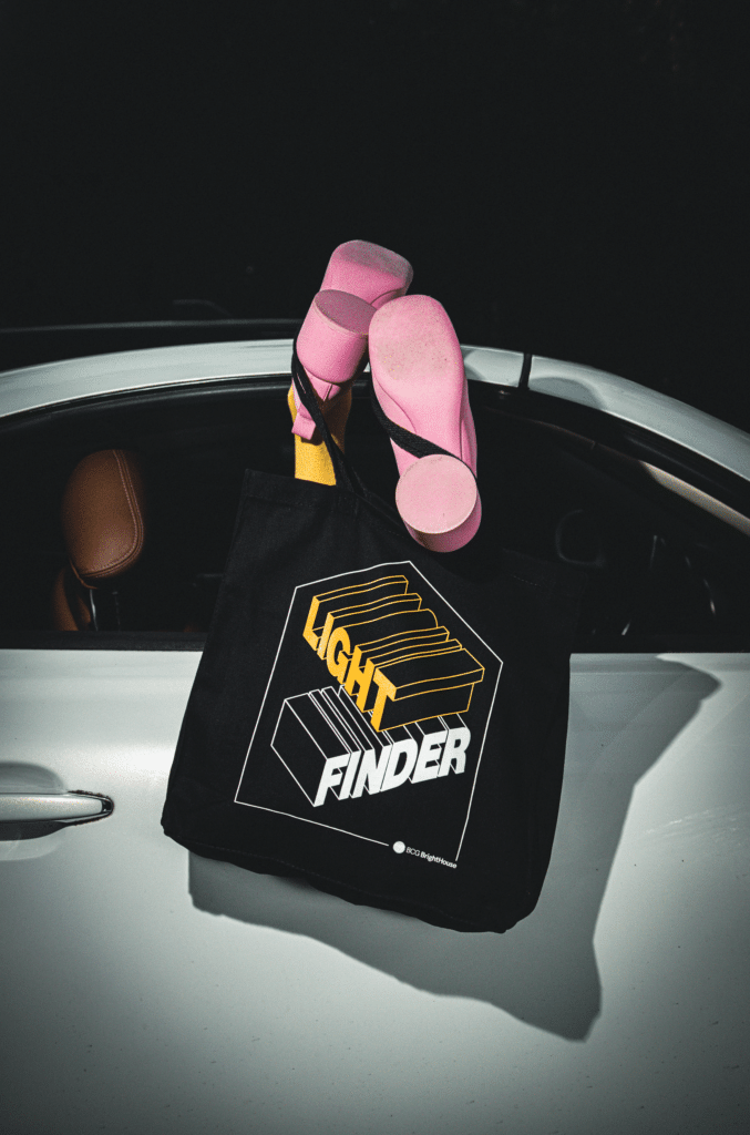
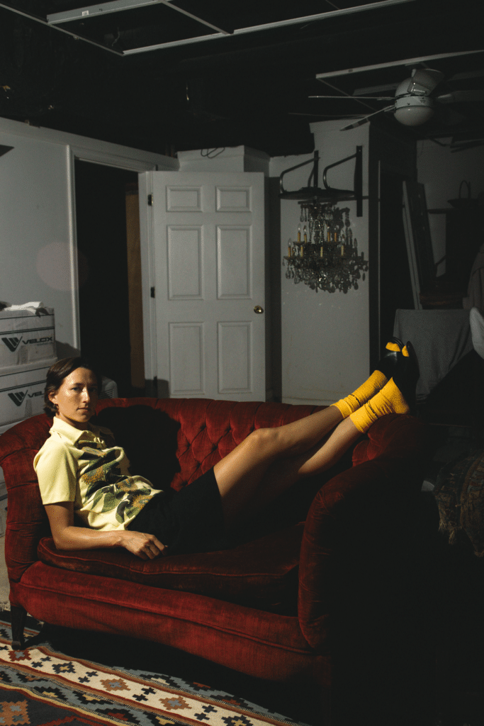
Hard flash meets grainy absurd humor
Visually, we took cues from photographers like Terry Richardson and Martin Parr, who use hard flash and high-contrast lighting to strip away any unnecessary artifice, creating a raw and unfiltered aesthetic. In our shoot, the hard flash added grit and texture to the images, allowing the products—whether a hat, tote bag, or stickers—to take center stage in visually arresting and sometimes humorous ways.
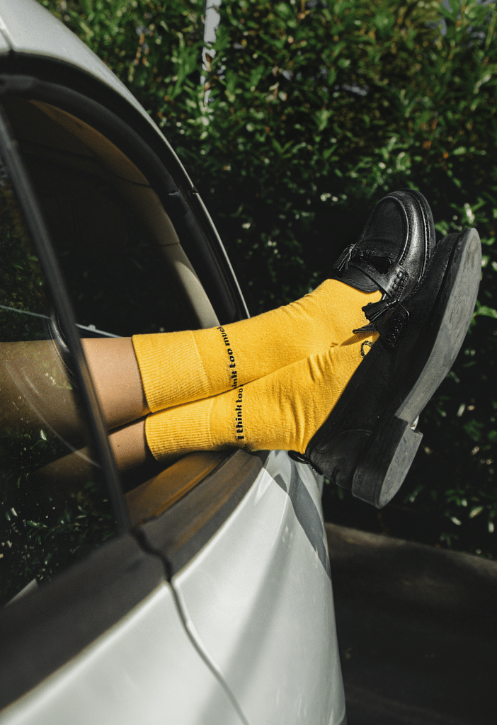
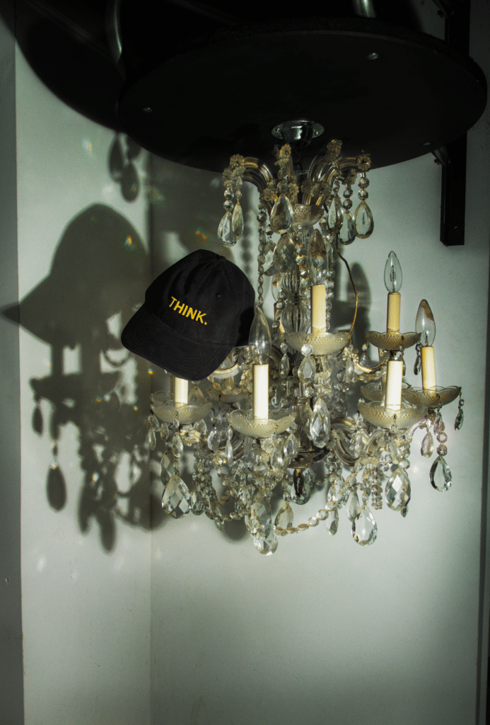
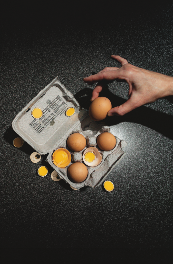
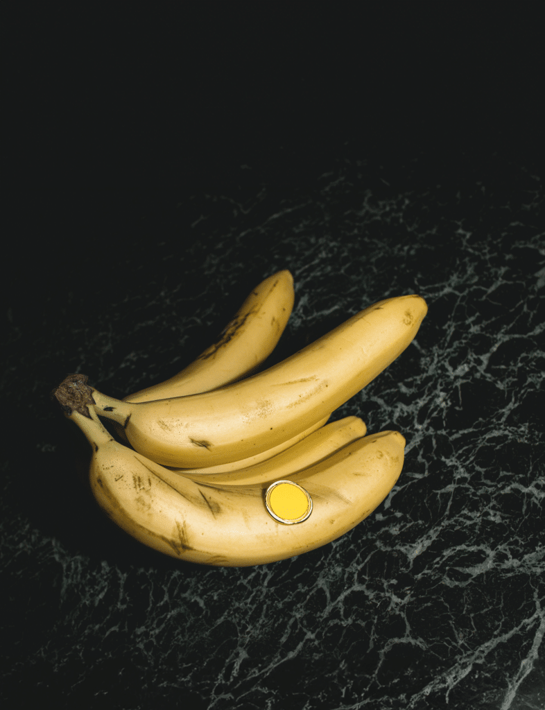
Absurdity, too, was central to our approach. Like Cattelan’s work, which often places everyday objects in bizarre, humorous contexts, we played with unusual juxtapositions and out-of-context interactions. In one image, a pin appears on an unexpected surface; in another, a hand rises from a pool of water gripping a notebook, transforming an everyday object into a surreal moment of intrigue. These images asked the viewer not to focus on function but to rethink the stories we tell about products. Explore Cattelan’s work here.
Pushing Boundaries Within a Framework
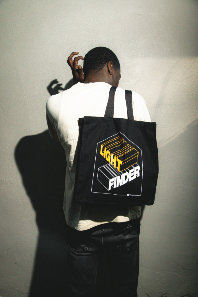
BrightHouse visual principles
Throughout the shoot, we remained grounded by our BrightHouse brand visual principles which can be found here. These principles, defined by our use of black, yellow, white, and clean design elements, provided the framework we were free to experiment with. The brand’s visual identity is an ongoing process, constantly evolving as we push the limits of what can be done within our guidelines. This shoot explored how far we could stretch those ingredients while still maintaining our brand’s core aesthetic.
It was about staying true to our principles yet finding new ways to explore them—reimagining what could be done with our signature colors and minimalistic design but also adding absurd humor and creative storytelling to the mix. We often find that true creativity emerges when we have “freedom within a framework,” a principle shared by many in the design and art world, including architects like Frank Gehry, who speaks about embracing unpredictability within structured design processes.
The Art of Planned Improvisation
We also took an approach of “planned improvisation”—a balance between structure and spontaneity that guided our shoot. About 80% of the project was meticulously planned, while the remaining 20% was left to improvisation. This allowed us to adapt to the environment, the models, the lighting, and even the mood on the day of the shoot. This concept resembles jazz improvisation or Gehry’s idea of allowing projects to evolve organically. Setting up a framework but leaving room for flexibility created an environment where the unexpected could shine.
We wholeheartedly embraced this mindset, knowing that our best ideas often come from leaving space for the unpredictable. For example, while we had specific ideas about how to place and shoot each product, the most compelling moments came when we allowed spontaneity to influence the outcome. This mixture of structure and play kept the creative process fresh and exciting.
Creativity as a Collective Experience
This project wasn’t just about individual creativity—it was a profoundly collaborative experience. The process of curating references, negotiating ideas, and co-creating brought the team closer together, reinforcing that innovation often comes from collective input. Each member contributed their unique perspective, shaping the final outcome into something far greater than the sum of its parts.
Charles Eames, who famously said, “The details are not the details. They make the design,” would appreciate the process we followed. Every detail in our project, from the choice of lighting to the inclusion of absurd humor, was deliberately crafted, but the collaboration made these details come alive. Learn more about Eames and his design philosophy here.
Lessons in Absurdity, Playfulness, and Experimentation
At its core, this photo shoot was a reminder of the power of playfulness and absurdity in creativity. By intentionally pushing the boundaries of our brand’s visual language and allowing room for improvisation, we opened ourselves up to new ways of seeing and thinking. This project allowed us to explore our brand’s identity in unexpected ways while remaining true to our principles. It’s an exercise we hope to continue—a reminder that true creativity often comes from the courage to challenge norms and embrace the absurd.
Ultimately, this shoot was a testament to the collective power of creative experimentation, something true to BrightHouse and how we do things. It reaffirmed the value of co-creation and how leaving space for spontaneity allows the most authentic ideas to emerge. At BrightHouse, we’re always evolving, constantly exploring what it means to push the limits of creativity within our established framework.
View the entire 2024 BrightHouse swag photoshoot below.